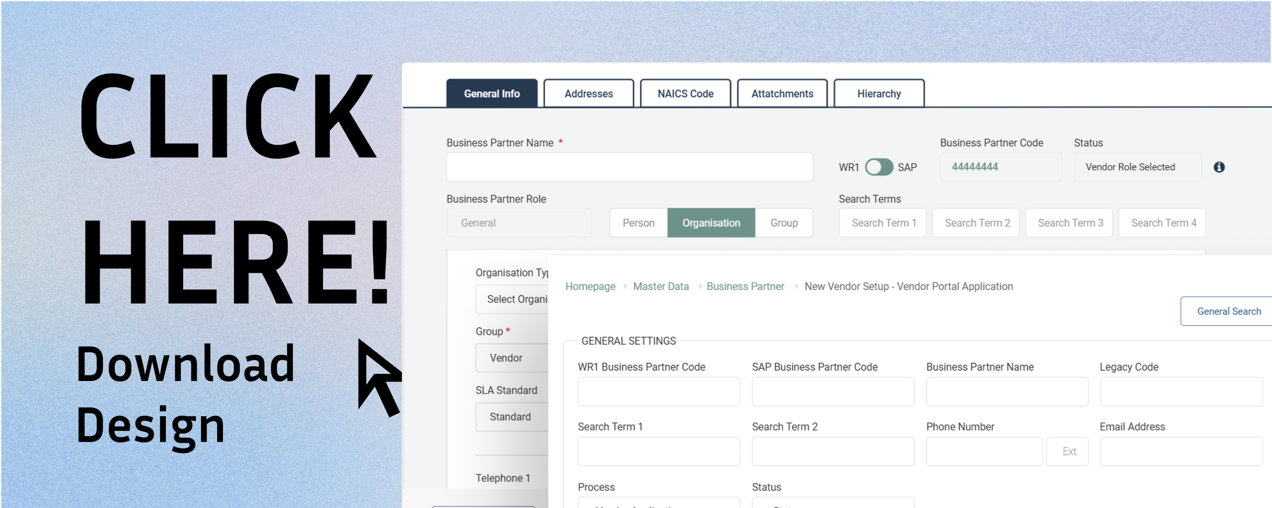
Business Partners Create & Update

Project Overview
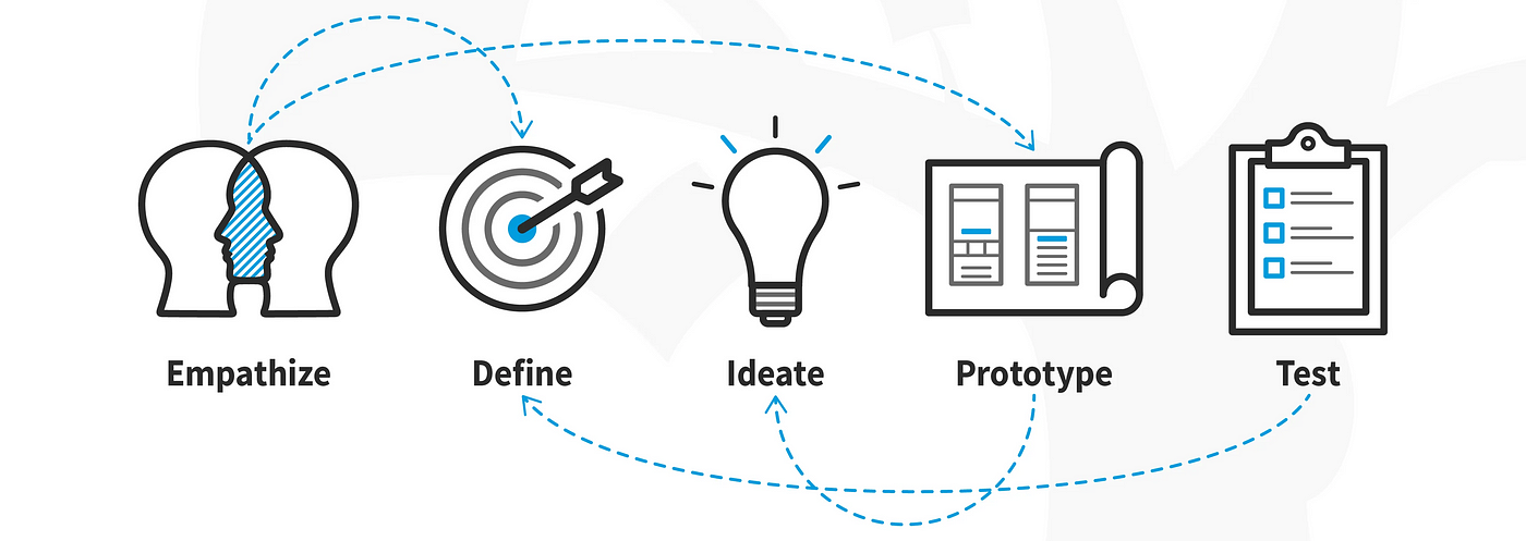
The Business Partners project aimed to streamline the management of customer, vendor, and lead information within the company's internal systems. The system needed to support the creation, modification, and deletion of Business Partner records while ensuring seamless integration with existing enterprise software. Key functionalities include defining account types, managing multiple addresses per partner and enabling bulk data imports for customer onboarding. Axure RP was my primary design tool.

Problem
The existing process for handling Business Partners was inefficient, requiring manual input across multiple departments with inconsistent data handling via Excel spreadsheets etc. Users faced difficulties consolidating accounts, managing address limitations, and filtering relevant contacts. Additionally, the need for automated updates and bulk processing was not adequately supported, leading to operational delays and increased administrative workload.

Solution
To address these challenges, a new user-centred interface was designed to simplify the creation and management of Business Partner records. The solution introduced role-specific workflows, mandatory field validation, and an intuitive search and duplication feature to improve efficiency. Users could now consolidate accounts for payment, filter contacts based on internal and external roles, and create new records in bulk via data imports. These improvements significantly enhanced data consistency and reduced administrative overhead.

Information Architecture

✏️ Outlining clear pathways for users to browse by category, search for specific Business Partners, customers, vendors, addresses, contacts, etc.
✏️ Streamlined categorisation of partner details, agreements, and performance metrics for quick retrieval and analysis.
Challenges: Balancing visual minimalism with sufficient product information was critical to maintaining clarity while keeping users engaged.
Low-Fidelity Prototypes

Process:
Developed low-fidelity wireframes to map core user flows and test basic navigation.
Iterated on designs based on early user feedback before transitioning to high-fidelity prototypes.
Feedback:
Users appreciated the minimalist aesthetic but requested clearer visual hierarchy for key actions.
High-Fidelity Mockups & Prototypes

Refinements:
Enhanced visual hierarchy with horizontal tabs, consistent typography, spacing, and button styling.
Improved navigation flow by adding clear labels and intuitive iconography.
Redesigned filter functionality for greater clarity and ease of use.
Impact: Increased user confidence in navigating the site, as reflected in qualitative feedback.
Design Iterations
Major Changes:
Simplified navigation based on user feedback to improve ease of browsing across categories.
Enhanced product imagery and layout for better visual impact and user engagement.
Adjusted typography and colour contrasts for better readability and accessibility.
Final App Designs
The final product was a sleek, responsive e-commerce platform with a focus on user-centric features. Key highlights included:
Clean, minimalist aesthetic focused on showcasing products without visual clutter.
Intuitive navigation with clear categories
Designed to accommodate future growth, allowing for additional features or business partner types without disrupting usability.
Product Success

Improved user task completion rates, particularly in product browsing and checkout flows.
Created a flexible, minimalist design system adaptable to various product categories.
Structured to guide business partners through key tasks seamlessly, from onboarding to managing partnerships.
What I Learned

Improved my ability to interpret and apply feedback constructively from both peers and industry professionals.
The value of balancing aesthetics with functionality to enhance usability.
The importance continuous feedback leading to stronger user experiences.