
Project Overview
The project involved designing a minimalist mobile app for streetwear, homeware, audio technology and art. This challenge was part of a 7 course series Google UX Design course on Coursera.
To create an engaging and user-centric design, I followed the complete UX design process, including research, ideation, wireframing, prototyping, and usability testing. The project included conducting online and phone-based surveys and interviews, where participants completed step-by-step tasks on low and high-fidelity wireframes. I also developed detailed user personas to guide the design.
Figma was my primary design tool, with Photoshop used for additional visual elements.


Problem
Users get distracted by busy interfaces & fail to make purchases. People seeking a seamless and stylish online shopping experience for unique streetwear, audio technology, homeware, and art often face cluttered interfaces and inconsistent user journeys. They need a minimalist online store that reflects their aesthetic values while providing a frictionless and enjoyable purchasing process.

Solution
Design a minimalist app that both improves user flow & reflects the demographic’s taste. To address the needs of the mentioned demographic and their online shopping experience, I designed a minimalist e-commerce mobile app. The solution features a clean, uncluttered interface, intuitive navigation, and a cohesive user journey tailored to the diverse product categories of streetwear, audio technology, homeware, and art. This was all guided by in-depth user research, including surveys and interviews, detailed personas and iterative feedback from usability testing.

User Research
Participants: 6 individuals participated in online and phone-based research.
Insights:
✏️ Users valued minimalist designs but struggled with cluttered and overwhelming interfaces in existing online stores.
✏️ They desired intuitive navigation that adapts seamlessly to mobile and desktop platforms.
✏️ Participants expressed a preference for highly visual product displays, prioritising aesthetics and functionality.
Process


User Personas

Persona 1:
Name: Jane Rivera
Age: 38
Occupation: Graphic Designer
Needs: A sleek and inspiring platform for buying
statement streetwear and contemporary art pieces.
Goals: To find unique products quickly without
distractions or unnecessary steps.
Frustrations: Feels frustrated with confusing filters and cluttered product pages & looses interest with bland design.

Persona 2:
Name: Blake Morgan
Age: 24
Occupation: Audio Engineer
Needs: A platform that offers clear product
comparisons for audio technology, with a focus on
functionality and design.
Goals: To browse curated selections effortlessly on both
desktop and mobile devices.
Frustrations: Finds it difficult to navigate poorly optimised sites.
Paper Wireframes

The Process:
I sketched paper wireframes to rapidly brainstorm multiple layouts, focusing on simplicity and clean navigation. This step allowed me to explore different concepts before transitioning to digital designs.
Digital Wireframes
Process:
I used Figma to develop wireframes that prioritised a clean, grid-based layout. Key features included prominent product categories, intuitive filtering options, and a responsive design to ensure usability on all devices.
Information Architecture

✏️ Outlining clear pathways for users to browse by category, search for specific items, and complete a purchase.
✏️ Mapping out common tasks, such as filtering by product type and adding items to the cart, ensuring seamless transitions across touch points.
Challenges: Balancing visual minimalism with sufficient product information was critical to maintaining clarity while keeping users engaged.
Low-Fidelity Prototypes

Process:
I created low-fidelity prototypes to test basic functionality and layout.
Feedback:
Users appreciated the uncluttered design but suggested adding more visual cues for navigation, such as icons or subtle animations.
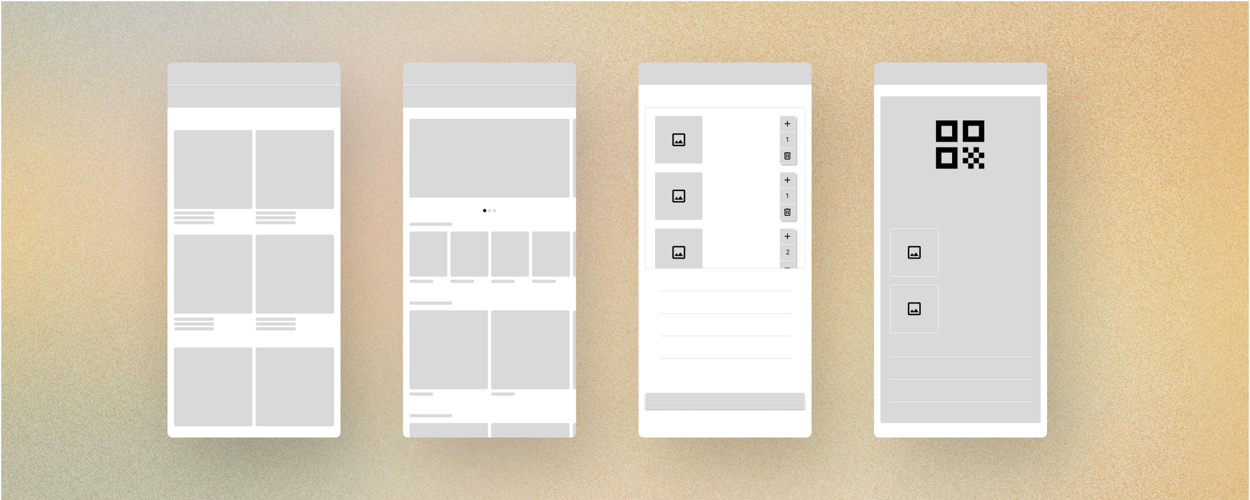
High-Fidelity Mockups & Prototypes

Refinements:
I enhanced the visual hierarchy by using bold typography and white space to draw attention to key elements.
Product pages included high-quality images, quick view options, and detailed descriptions.
Photoshop was used to refine imagery and ensure a polished, professional aesthetic.
Impact: The final prototypes provided an elegant, intuitive shopping experience, combining style with usability.
Usability Testing
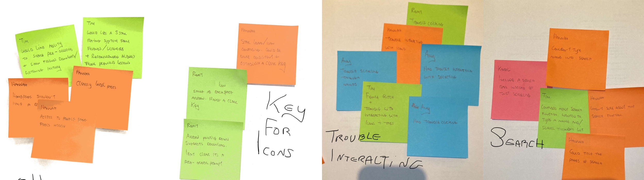
Tasks: Participants were asked to:
✏️ Select an item of their choosing & navigate to the cart to complete purchase.
✏️ Select an item of their choosing from the side menu & navigate to the cart to complete purchase.
Findings:
✏️ Users completed tasks with minimal difficulty, highlighting the ease of navigation.
✏️ Users reported issues with interacting with buttons & icons.
Design Iterations
Major Changes:
Enhanced filter visibility on mobile to improve usability.
Improve issues with interacting with buttons & icons.
Adjusted visual elements to better align with user preferences for aesthetic minimalism.
Final App Designs

Final Desktop Designs

The final product was a sleek, responsive e-commerce platform with a focus on user-centric features. Key highlights included:
Seamless navigation across categories and devices.
Aesthetic product displays that complemented the minimalist design.
An intuitive checkout process optimized for efficiency.
Product Success

Validation:
Peer-reviewed within the course with scores exceeding the required 80%.
Praised by senior UX designers for its clean layout and strong usability principles.
What I Learned

The importance of iterative feedback in refining designs to meet user needs.
How to balance visual aesthetics with functionality in an e-commerce setting.
The value of designing for mobile-first while ensuring seamless desktop compatibility.